


What Severance (season 2) teaches us about design
A deep-dive into branding, space, cinematography, and product through a design lens

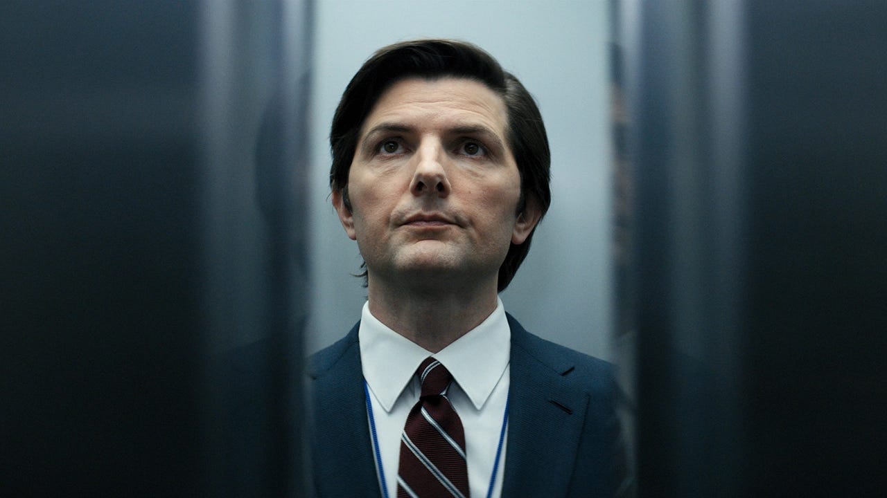
There are shows that look nice... and then there are shows like Severance, where every single pixel feels designed—with intention, tension, and surgical precision.
Season 2 doubled down on everything: eerie mood, unsettling environments, clever world-building. But here’s the thing: Severance isn’t just great television. It’s a masterclass for designers.
Let’s break it down what makes this show a brutal benchmark for design teams everywhere.
Brand design
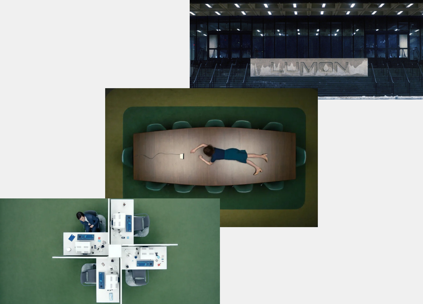
Lumon is a brand identity system. Season 2 doubled down on world-building — not by expanding locations or adding characters (though it did both), but by strengthening Lumon’s psychological grip.
What makes the branding genius?
Consistency across every touchpoint
From the bizarre corporate lingo to printed office manuals and monotone presentations, Lumon is never off-brand. There’s no playful messaging. No visual deviations. The brand is as rigid and oppressive as its rules.

Tone of voice as identity
Season 2 brings us deeper into the cult-like mantras and rituals of Lumon. "Your overtime is our privilege." The branding lives through behavior, not just design.
Subtle world-building
The Lumon seal is on mugs, folders, welcome kits. It feels like a place that could exist because the designers built every detail with real-world logic.

"We wanted to create a space that looks real but makes no sense at all."
⎯ Production designer Jeremy Hindle
Designers, take note: Branding isn’t just a logo. It’s how everything feels. When you build emotional consistency across visuals, tone, space, and behavior, you’re not just branding — you’re brainwashing (the good kind... or the creepy Lumon kind).
Visual identity
If Lumon Industries had a brand guidelines PDF, it would be the cleanest, most terrifying thing you've ever seen.
The visual identity system across Severance is so polished it puts many real companies to shame — and that’s exactly why it works. It’s too perfect. Too sterile. Too consistent. The kind of branding that makes your skin crawl because it feels like it was designed by someone who’s never felt joy.
Let’s break down the key elements:
1️⃣ Typography that speaks compliance
The show uses a custom, brutalist type system that reinforces Lumon’s values: clarity, rigidity, and zero personality.
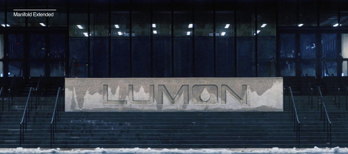
Manifold Extended CF: The main typeface used in Lumon’s logo and signage. Inspired by Microgramma, it’s heavy, geometric, and corporate to the bone.
Forma DJR: Found in employee manuals and apology memos. It’s clean and modern—but emotionally flat.
Input Sans: Used in the Break Room scenes for the Compunction Statement. Designed for code, it gives everything a cold, mechanical tone.
Optima: Surprisingly, this soft-but-serious serif is used on the Compliance Handbooks, hinting at formality and reverence.

2️⃣ Product design = narrative design
Lumon’s visual identity isn’t just on screens or signs — it extends into every physical object:
Employee ID badges: Stark, minimal, with sharp corners. You wear it like a number, not a name.
Welcome kits & handbooks: Embossed, grayscale, unreadable in tone but beautiful in execution.
Finger traps, melon cards, Kier figurines: Childlike “rewards” that toe the line between funny and deeply unsettling.
These aren’t just props — they’re extensions of the brand. Every item reminds you that you don’t own your time, your name, or your freedom.

3️⃣ Color and uniformity
The entire Lumon world runs on a brutally limited palette — not just for sets and costumes, but for packaging, signs, and even reward items.
Stark White – walls, folders, manuals. The “clean slate” of corporate obedience.
Muted Green – carpets, ID badges, certain seating — artificial calm, almost medicinal.
Neutral Gray – used in cards, files, machines. Unemotional and standard-issue.
Black or Navy – typography, logos, suits. Authority, simplicity, and zero room for interpretation.
 — Art of the Title")
Did you know? The title sequence was designed and animated by Berlin-based artist Oliver Latta, also known as Extraweg, who is renowned for his unsettling and thought-provoking 3D animations. The minimalist typography featured in the title sequence was crafted by Teddy Blanks, whose design complements the sequence's eerie visuals.
Like what you’re reading? Support the work by becoming a ☻VIP and keep the ideas flowing. I’m running a special sale with 20% off for 1 year!
Spatial design: architecture as emotional control
Let’s talk architecture. I’ve been deep-diving into the work from production designer Jeremy Hindle, and let me tell you, I gathered a lot of info. Mainly, you can take the office as (still) the main character, and in Season 2 it gets weirder, more disorienting, and even more claustrophobic.
The office is a maze — literally
Long hallways, looping layouts, and no windows anywhere. Even the characters can’t tell if they’re going in circles. It’s designed confusion.
"The goal was to make the actors (and the audience) disoriented."
⎯ Production designer Jeremy Hindle
Low ceilings and heavy symmetry
Everything feels too tight and too orderly — like the walls are about to collapse in on themselves. It creates a sense of constant tension and surveillance.

Room designs with a deeper meaning
For example, the new Family Visitation Suite is crafted to resemble a comfortable living room, complete with familiar furnishings and a warm ambiance. Its purpose is to provide a controlled environment where innies can experience personal connections, blurring the lines between their work and personal lives. This setting serves as both a reward and a tool for psychological manipulation, reinforcing Lumon's control over its employees.

Real design detail:
Did you know that they tested over 50 shades of white to find the perfect tone for the hallways? Yeah, 50. That level of obsession over how sterile and uncomfortably perfect things feel?
Source: Movieluts
Designers: Space tells story. When the environment becomes a character, you’re no longer just decorating — you’re building narrative through architecture.
Cinematography: framing, tri-color palettes, and emotional minimalism
Cinematographer Jessica Lee Gagné worked hand-in-hand with the production designer, art director, and props teams to bring the sterile, surreal world of Lumon to life. This wasn’t just a DP doing lighting — it was full creative collaboration.

“I think that Severance was teamwork. So as a DP [director of photography] you see yourself as one of the big parts of creating the world. But on a show like Severance, you really have to work with the production designer, props, everyone. It was a big team effort to get it through.”
— Jessica Lee Gagné, Cinematographer
This shows in every frame. Lighting, palette, framing — all of it aligns with the story and production design, creating an oppressive harmony.
Let’s break down the visual toolkit:
Blocking and framing
Severance uses classical art composition in nearly every frame. Often the subject takes up two-thirds of the shot, while the other third is clean negative space or blocked by architecture. It gives the viewer a subconscious sense of imbalance and control. Intentional discomfort.
Hear what inspired cinematographer Jessica Lee Gagné and director Ben Stiller for this visual approach:
From the interview above: In crafting the distinctive visual style of Severance, Jessica Lee Gagné drew significant inspiration from Swedish photographer Lars Tunbjörk's book, Office. This collection captures the absurdity and monotony of office life, influencing the show's portrayal of the Lumon workplace.
By incorporating elements from Tunbjörk's work, Severance achieves a visual narrative that underscores themes of isolation and conformity within corporate culture.

Tri-color palette (but don’t give it too much credit)
Let’s be real: using a limited color palette isn’t exclusive to Severance — it’s fundamental to good cinematography. The so-called “three-color rule” (also known as the 60-30-10 principle) is used across architecture, interiors, film, branding… this isn’t new.
That said, Severance executes it brilliantly:
Green → the artificial comfort of Lumon
White → the sterile, lifeless structure
Blue or black → conformity, coldness, isolation


The real magic? These colors appear in nearly every indoor Lumon scene. And it’s not just visual minimalism — it’s a psychological tactic.
"We were very careful with our use of colors, where blue dominates the palette, and red is reserved for love or blood."
⎯ Production designer Jeremy Hindle
Contrast that with scenes outside of Lumon, which feel busier, warmer, more alive. There are more colors, more chaos. Real life.
Source: Movieluts
Designers, this is the lesson: Pick your palette with intent. Consistency isn’t enough — color should do something. It should manipulate, guide, and communicate before any copy is read.
🔥 Want 90 days of premium for free? Share my newsletter with your circle and watch the counter climb. The instant 15 friends subscribe, you score 3 FULL months of ☻VIP access worth of deep‑dives, time-saving resource library, access to archive, Monthly (creative) Boosters, and more… FOR FREE. Turn your network into savings and bragging rights. Race you to 15👇
Product design
Everything inside Lumon is familiar but… wrong. That’s what makes it so good.
Analog tech in a digital world
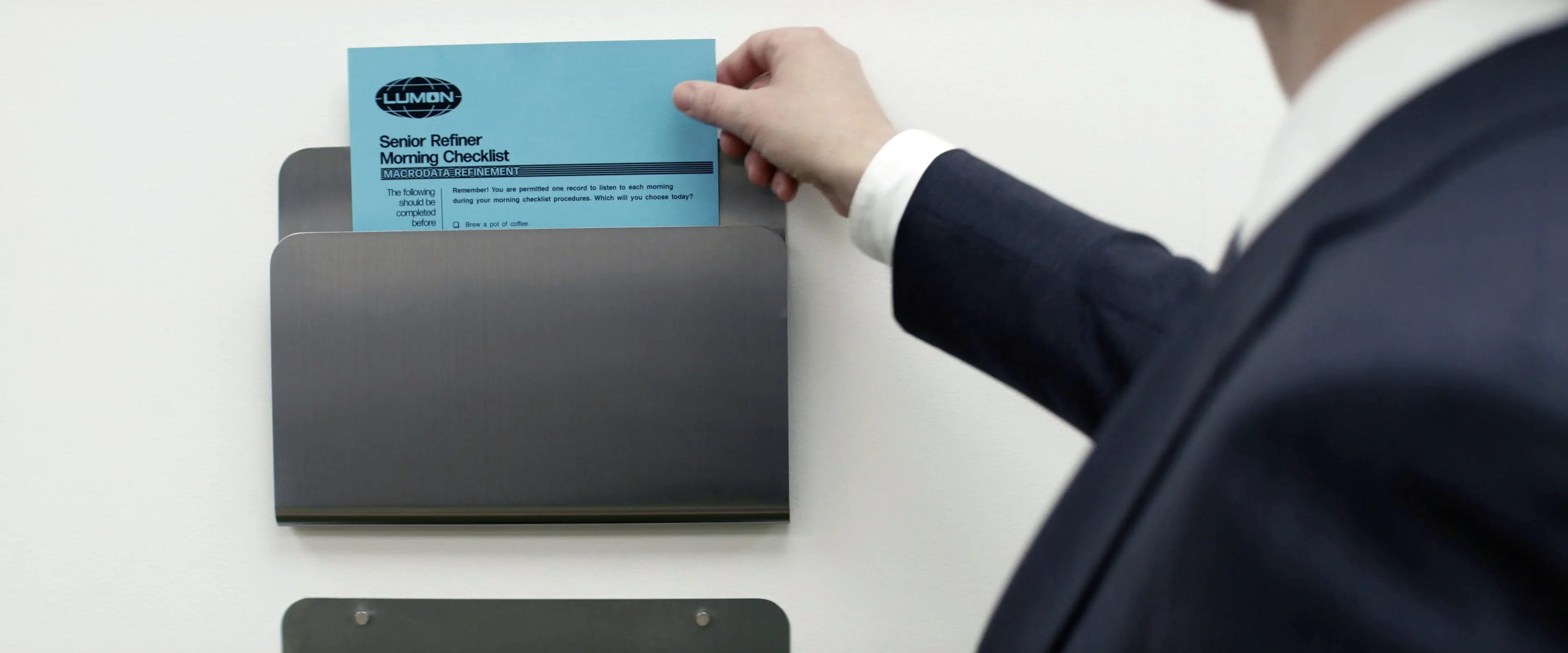
The computers, the phones, the filing systems — none of it is modern. Everything’s just outdated enough to make you feel like time stopped somewhere around 1983. It’s nostalgic, but cold.
You can also become an MDR team member (sort of) thanks to this brilliant fan site.
Intentionally inconvenient
MDR keyboards feel like they’re designed to slow people down. You can’t multi-task. You can’t jump between tools. You are stuck in a box. That’s not poor UX — that’s psychological UX.

Rewards that feel like punishments
The "Finger Trap" toy or the melon party is just the right level of bizarre. They're designed with care, but not love. And that difference is palpable.

Real-World Influence: Blanked Studios' Lumon-Inspired Collection
Blanked Studios, renowned for its "dystopian brutalist" designs, launched a Lumon collection. This (unofficial) collection features chrome office accessories branded with Lumon's logo, including a standing desk folder, valet tray, industrial accent lamp, and coasters. Each item is meticulously crafted to mirror the show's minimalist and eerie corporate culture.
Unfortunately, they’re all sold out, but you can subscribe to their Early Access newsletter to be the first to know when they’re back.

Takeaway?: Product design isn’t just function. It’s feeling. Make sure the tools you design either empower people… or oppress them (if you’re building your own dystopia, I guess).
My final thoughts
Season 2 of Severance isn’t just a great show — it’s a design masterclass.
From spatial layouts to visual hierarchy, color psychology to narrative tone — every element is intentional. It's what happens when a story isn’t just told with words or actors, but with objects, layouts, light, color, and silence.
If you’re working on a branding project, campaign, visual system, or even a product interface — there’s so much to steal (respectfully) from this show.
Every object is a design decision.
Every space carries emotion.
Every color has a job.
That’s the kind of design thinking we should aim for — not more design, but deeper design.
Until next time!

This read was awesome ✨
I liked your POV :)